As the developers continue their work, our research team is continually testing the game to verify its functionality. Always using the non-cancerous GM12878 cell line, we are now running new tests on chromosomes 1, 20 and 21.
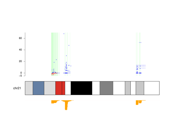
We have started to prepare a first graphic that allows to visually illustrate the results obtained from the tests. Here we show you the example of the analysis of the games performed on chromosome 21.
The rectangular idiogram represents our chromosome, divided into regions that are coloured according to their functional characteristics. In the figure you can see a red and a blue section: they are part of the central chromosome region (called the centromere) which normally contains many repetitive sequences. Other regions are coloured in grey scale, a colour that indicates the density of the genes. The terminal regions of the chromosome (called telomeres) are also rich in repetitive sequences.
Below the ideogram we have represented (in yellow) the histogram of the number of games played for each region of the chromosome: the peaks indicate that for this test we have focused on studying specific regions, and in particular those close to the centromere, since it is in these areas where the algorithms are not very precise in the reconstruction.
Above the chromosome idiogram there are two overlapping levels of information: the blue dots indicate each player’s score, relative to the result of the algorithm, and the vertical bands indicate whether the corresponding regions of the chromosome were resolved with little precision (white) or a good precision (green). White regions will need more analysis while the green ones, can be considered resolved.
We would like to emphasize the red points, in correspondence with the vertical bright green band: they indicate that that specific region has been resolved very well by the players and is most probably an “Eureka!” region. In these regions identified by players, the research team will carry out a more precise analysis to get more results.
In the case of this chromosome we can see that the regions near the centromere (red rectangle) are the most interesting.
How can be better show such a set of complex information in a single image?
In this period of health alert we all have learned that graphics are not always easy to interpret, even for experts. For this reason, in the coming weeks we will meet with a selected group of citizens to work on the presentation of the results in order make the message as simple and clear as possible and reach all the public.